
PROJECT OVERVIEW
THE PRODUCT
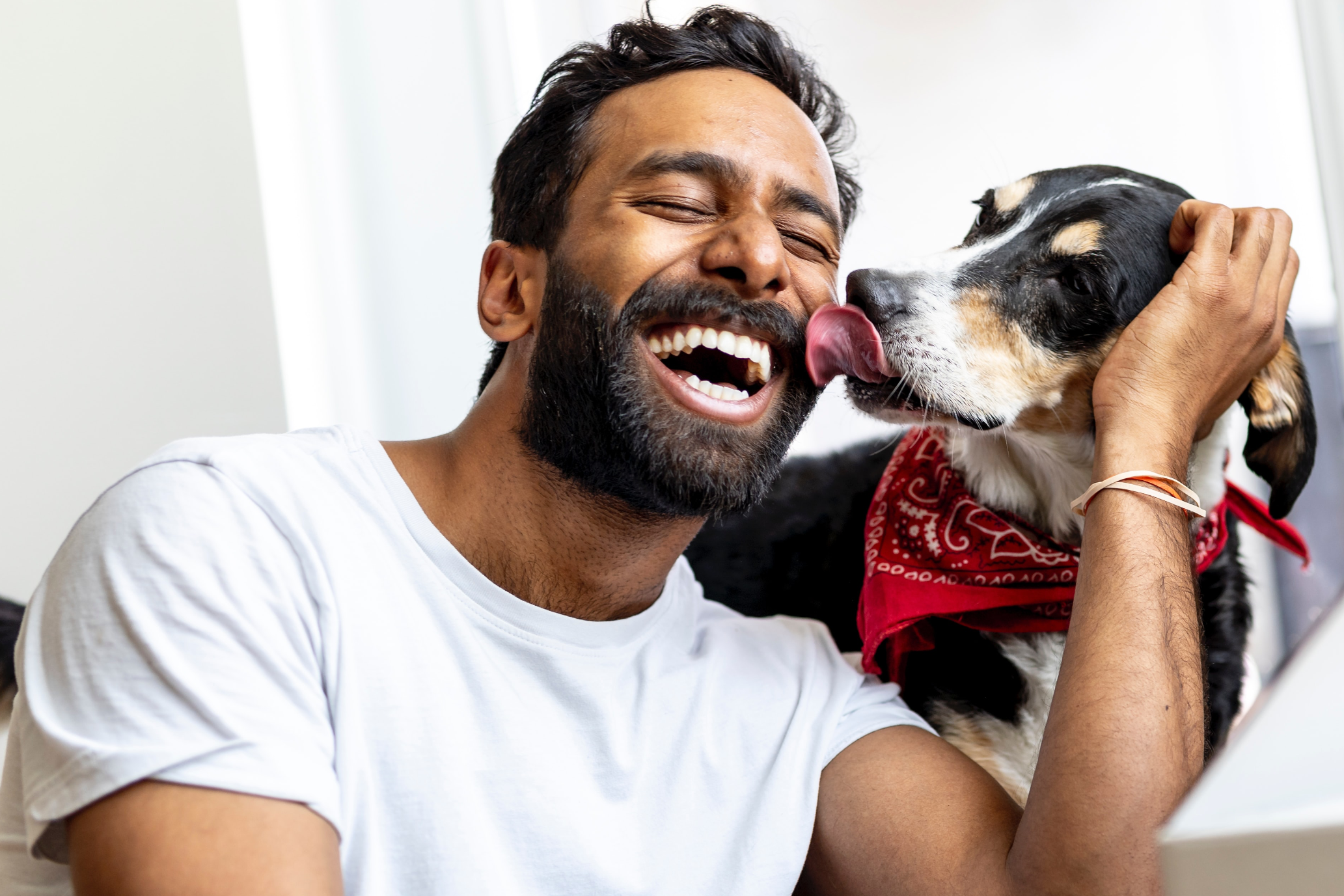
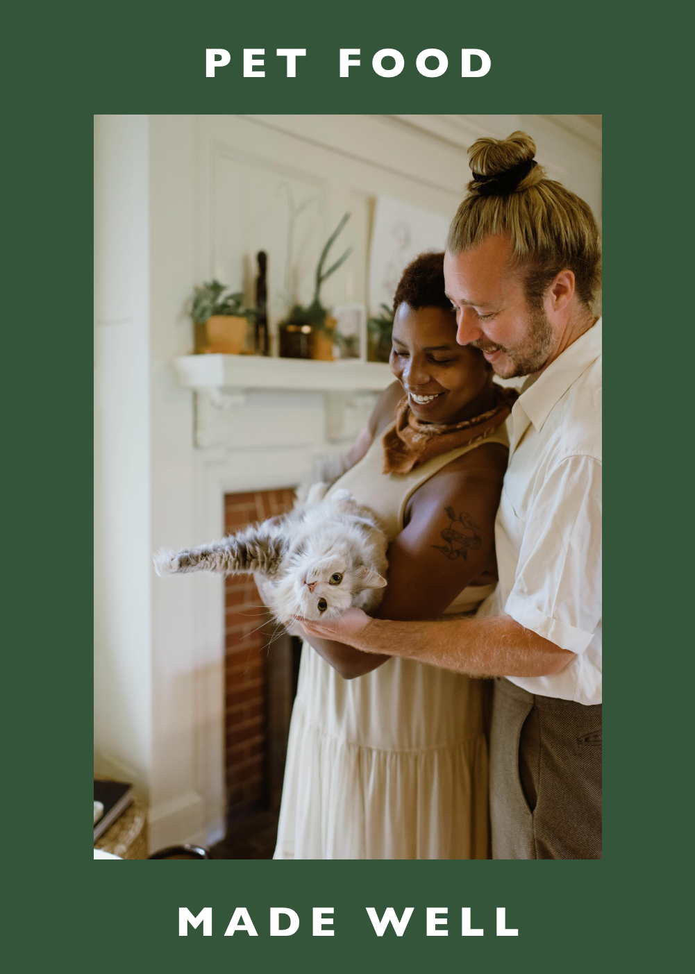
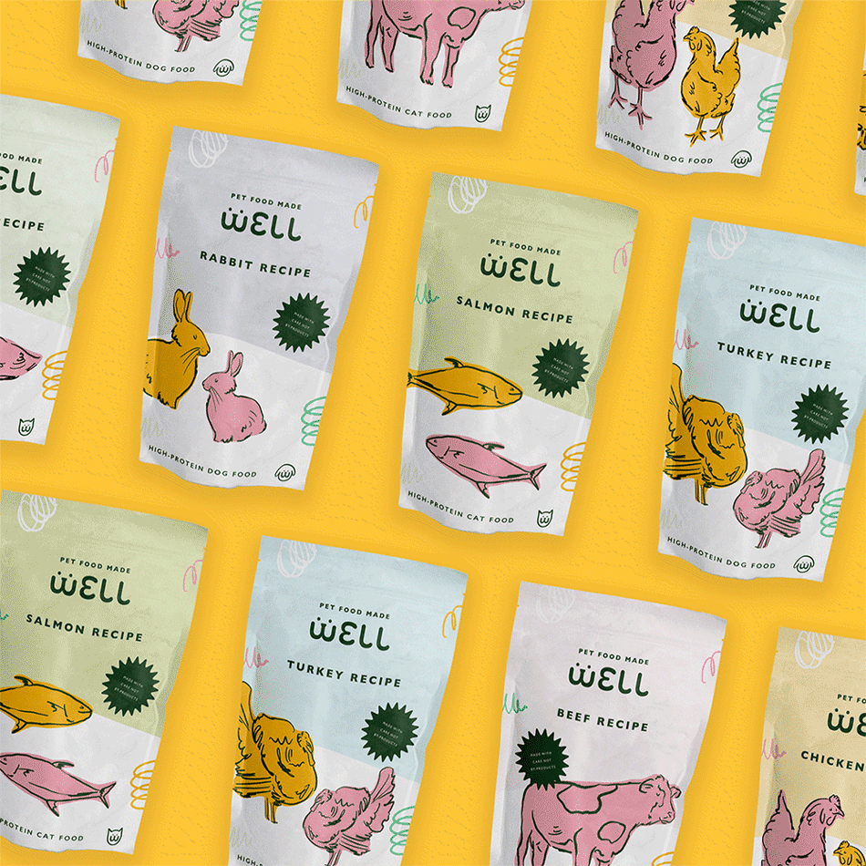
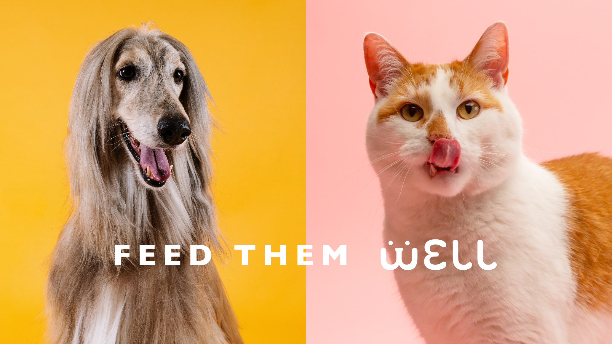
Well is a conceptual pet food brand that focuses on crafting thoughtful food made for pets. They wanted to create pet food that would be a convenient option for pet owners to turn to, because of this they made it a goal to be transparent with their ingredients. Their target customers are any pet owner or parent that is concerned with the quality of the food for their pets.
view the prototypeDuration
September 2021
TOOLS
Google Sheets, Adobe XD, Illustrator, Photoshop, After Effects, Maze, Figma, Grammarly
THE PROBLEM
Pet owners often have difficulty finding quality food for their pets at local and big box stores that is a convenient option while prioritizing their pet’s health.
THE GOAL
Design a responsive website for Well, a conceptual pet food company looking to shake up the pet food industry by providing quality and convenient pet food.
MY ROLE
UX designer designing the responsive website for Well from conception to delivery, including developing their brand identity and conducting UX research.
Process

Empathize
The Summary
I conducted interviews and was able to create an empathy map to attempt to understand the users I would be designing for. A majority group that was identified through my initial research were working professionals with pets that care deeply about the quality of life of not only themselves but of their pets as well.
Research revealed that quality wasn’t the only contributing factor as to where pet owners purchase pet food, but they tend to lean towards a company that is fully transparent regarding their ingredients and offer a delivery service like a subscription package of some sort.
Competitive Audit
I was able to conduct a competitive audit comparing several direct and indirect competitors to try to expose gaps and opportunities to address within Well’s website.
Define
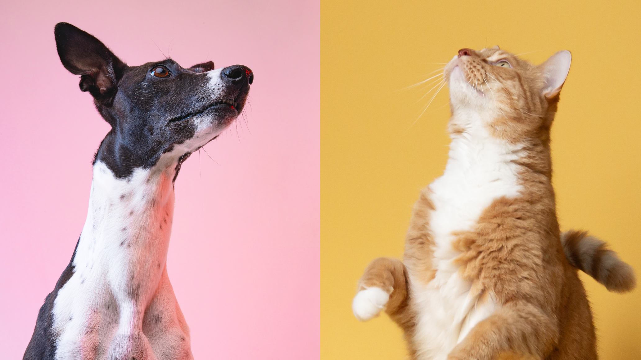
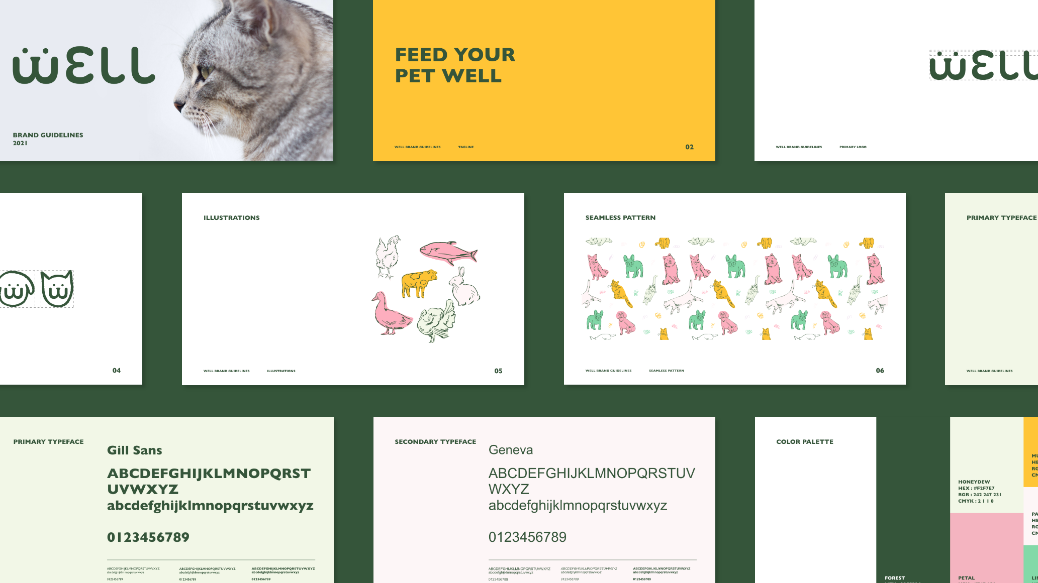
Brand Identity
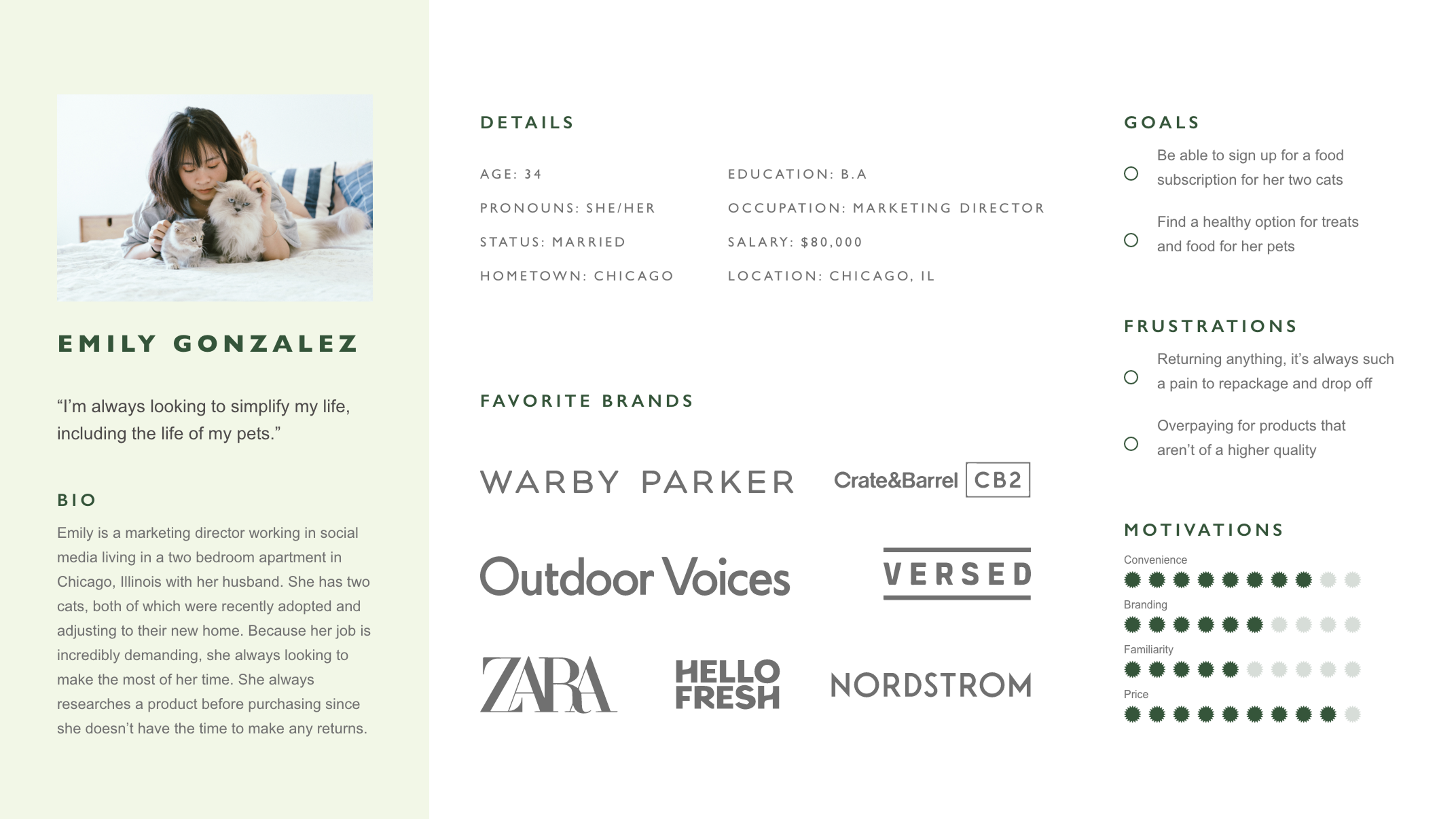
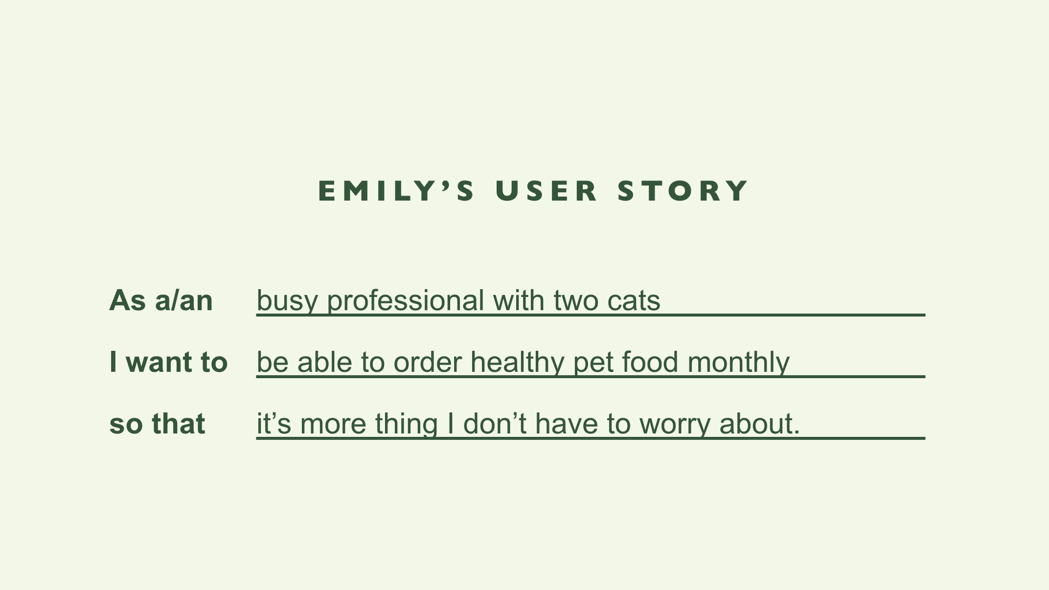
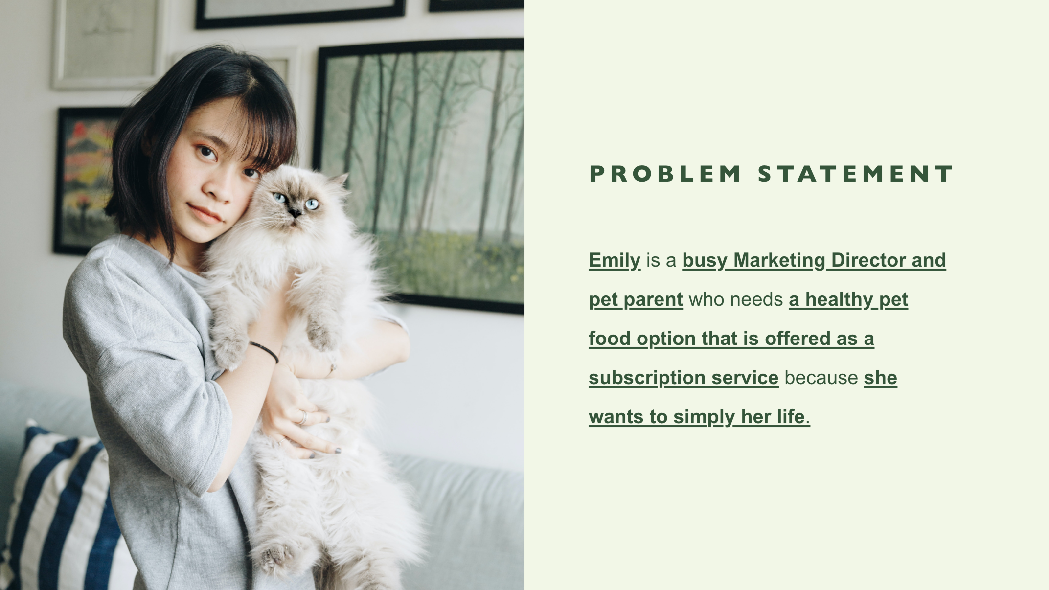
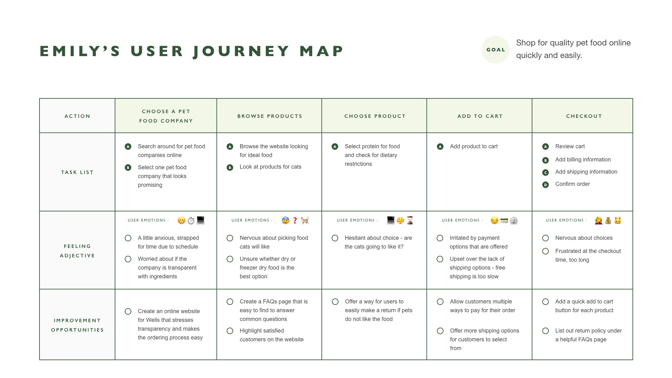
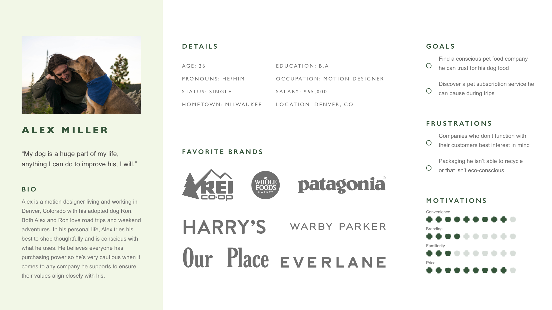
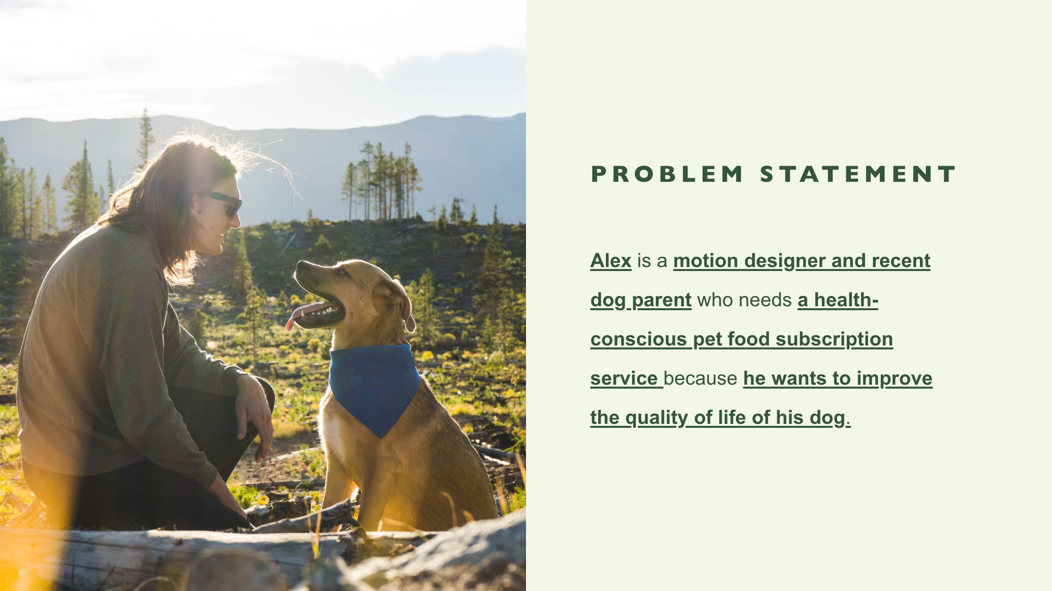
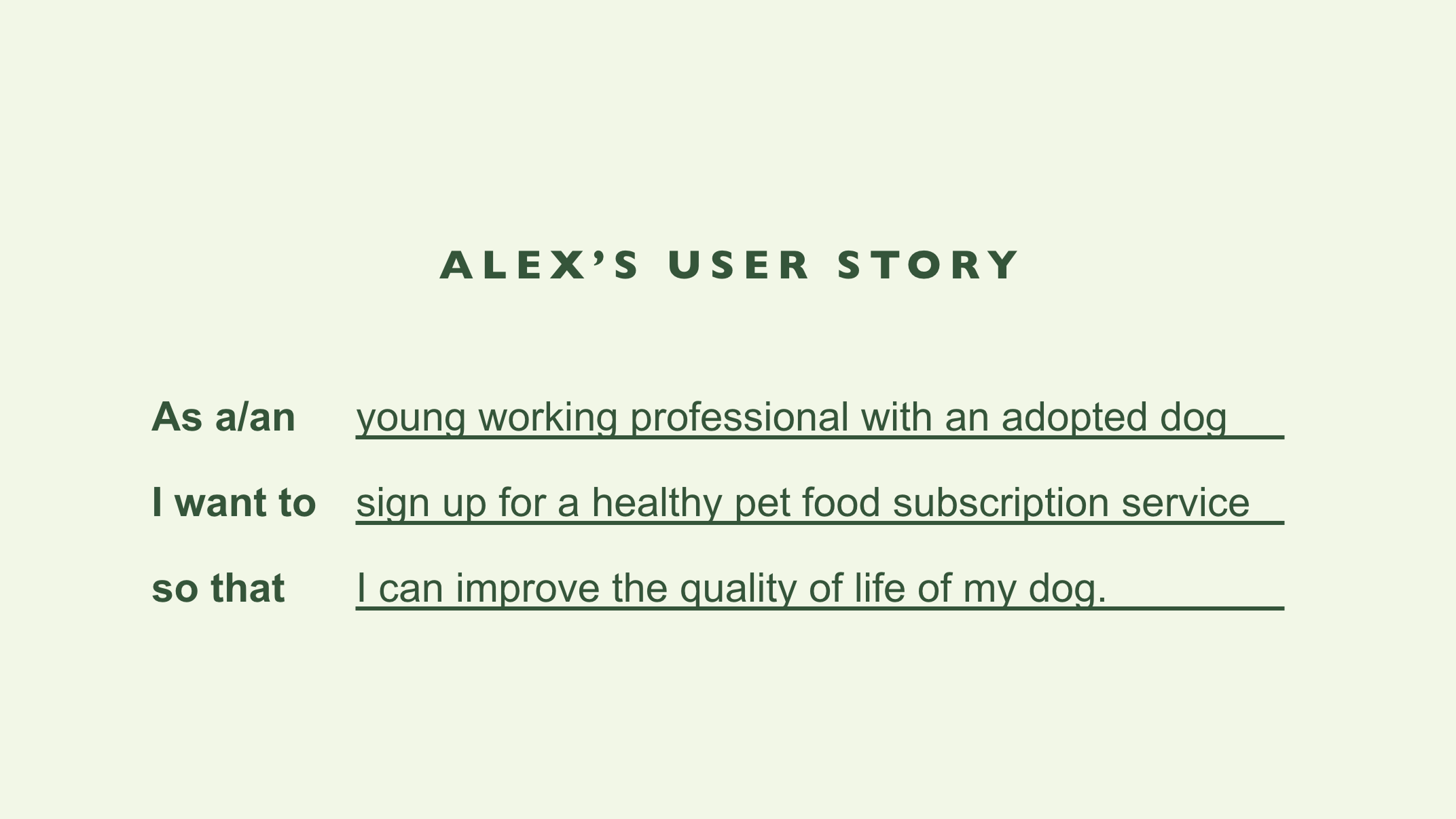
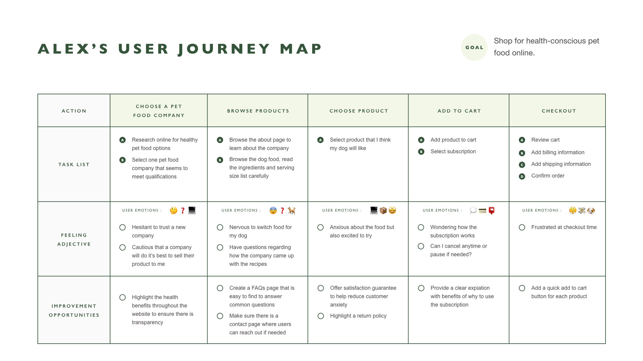
Personas
Based on my initial research, I was able to condense my findings and create two personas with accompanying user stories, problem statements, and user journeys.
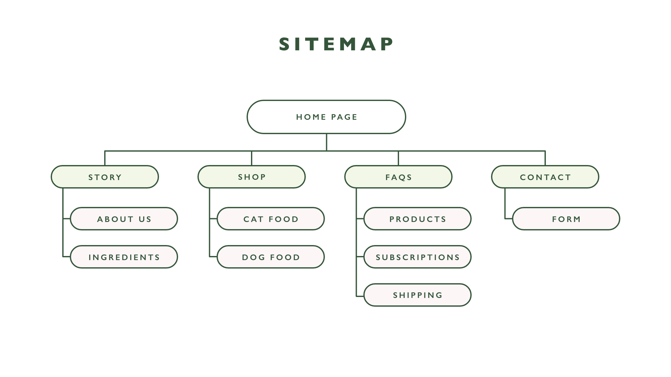
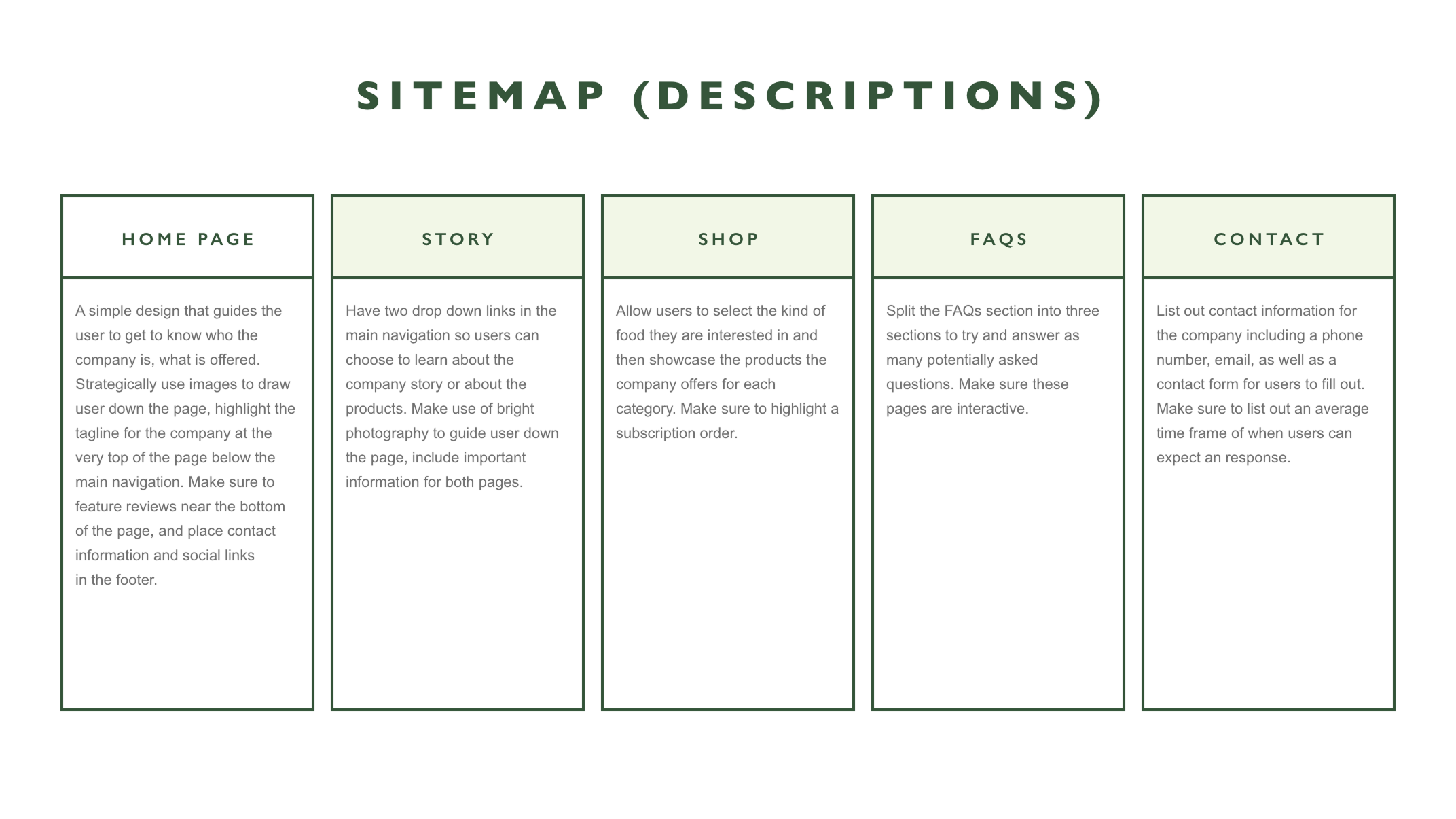
Sitemap
An overly complicated process for ordering food and finding important information was a clear pain point for users. In order to reduce this, I created a simple sitemap that prioritized simplifying options for users.
Ideation
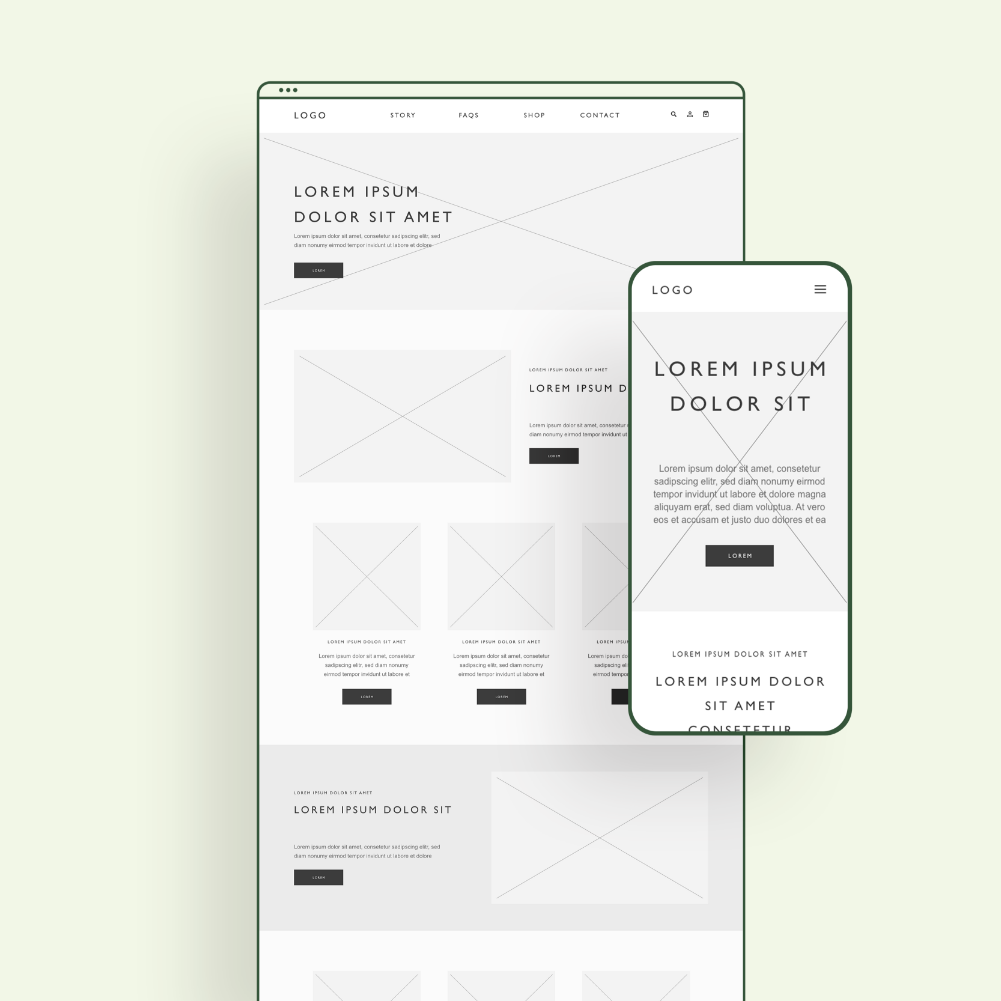
I sketched out paper wireframes for each screen in the website while keeping user pain points in mind regarding the checkout flow. The Home Screen paper wireframe variations focused on highlighting products as well as important information customers might want to know right away. Because I wanted to make sure the site was responsive I started to sketch out what the mobile version of the site.

Prototype
Digital Wireframes
As I worked through the process and move into digital wireframes, I was able to identify that reducing the number of steps a user would take on the site would be beneficial.
In my original sitemap, I had a drop down menu for several of the pages. This overly complicated the flow, so I decided to remove them.
View the low-fidelity prototype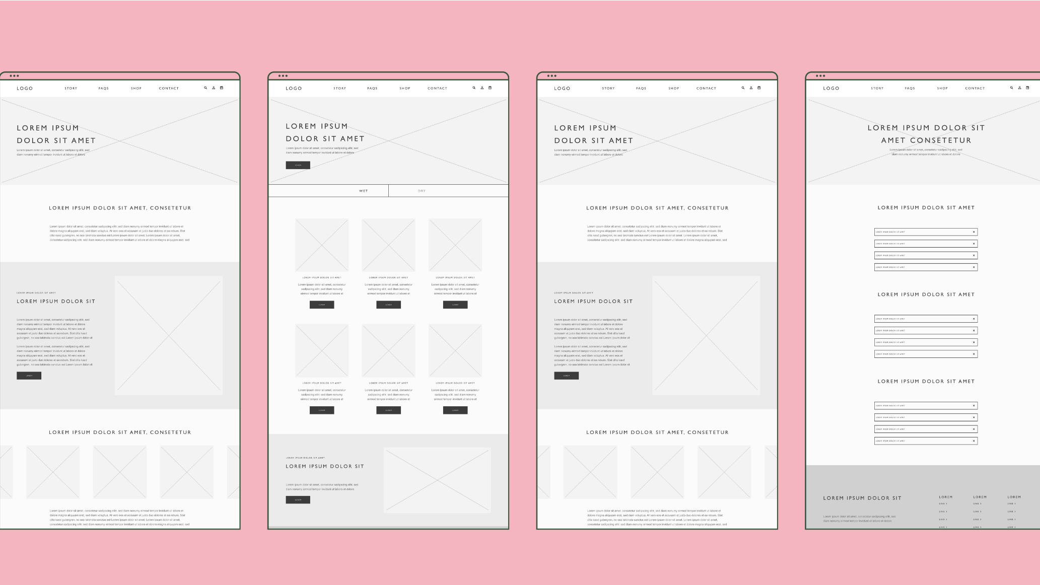
Test
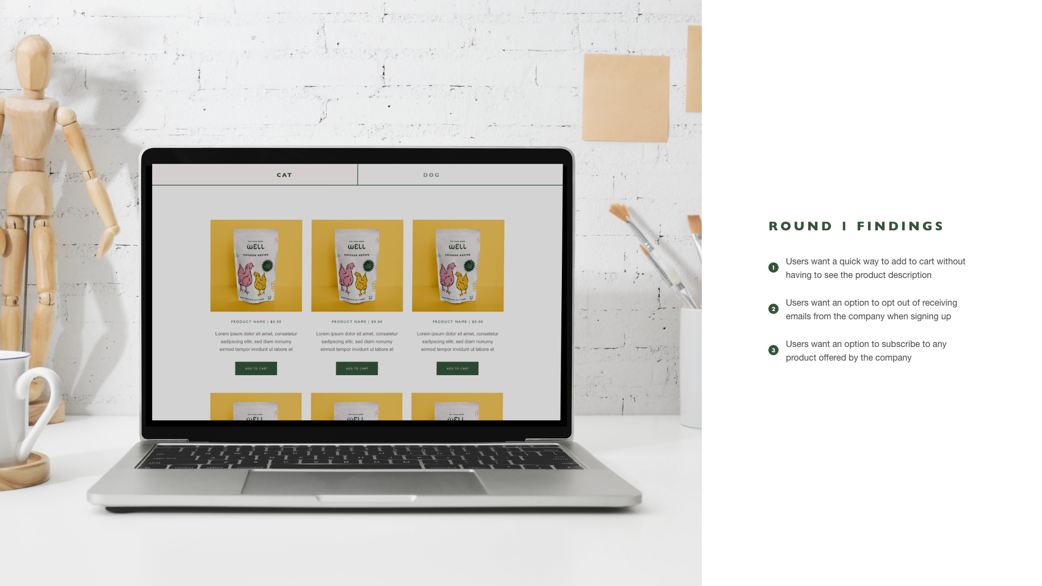
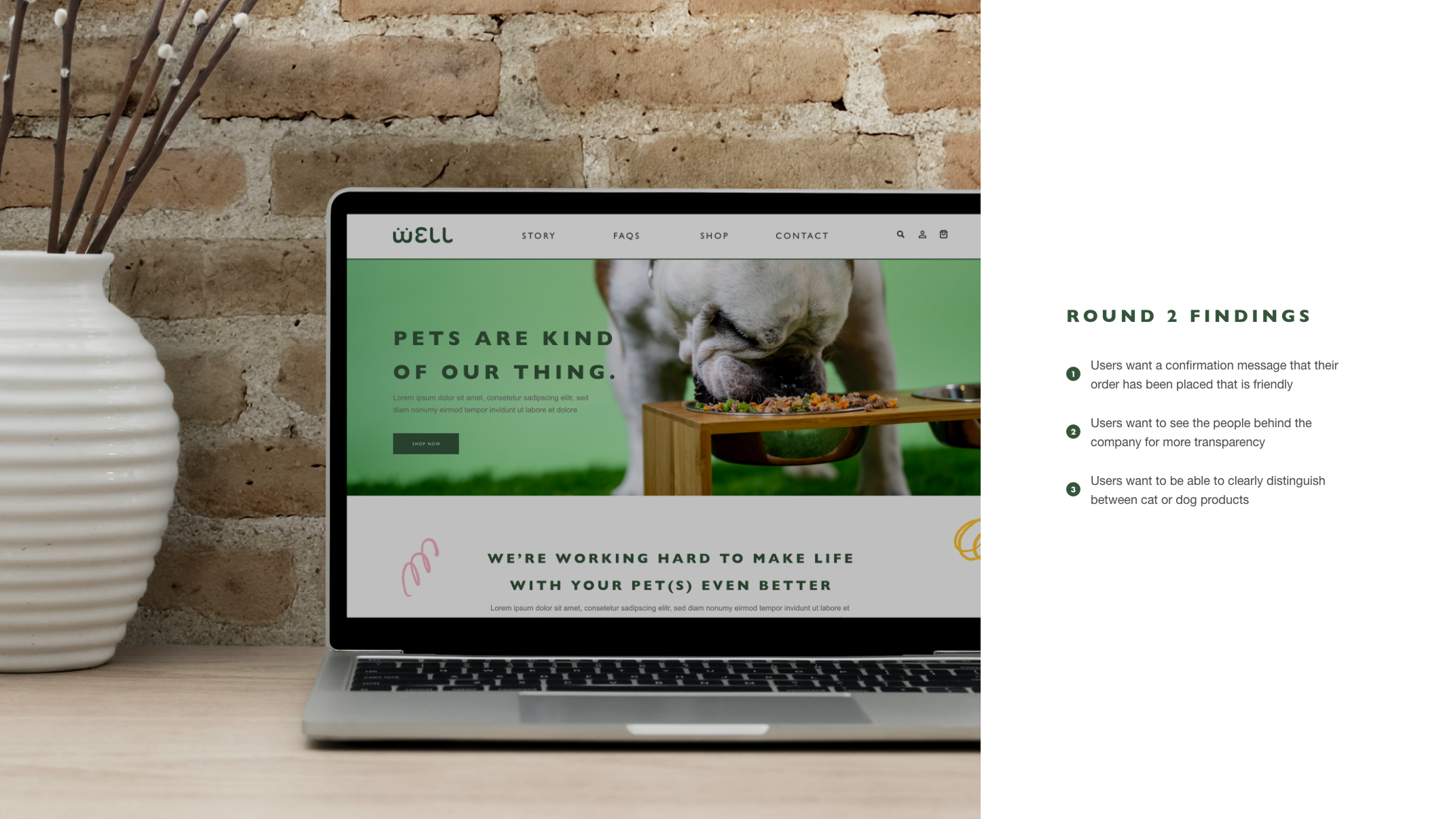
Usability Testing
I conducted two rounds of usability studies for this project. The first round of findings helped refine the design. The second study helped catch additional pain points.
View the prototypeUsability Parameters
Study Type • Unmoderated usability study via Maze
Location • United States, Remote
Participants • 6 total
Length • 25-30 mins
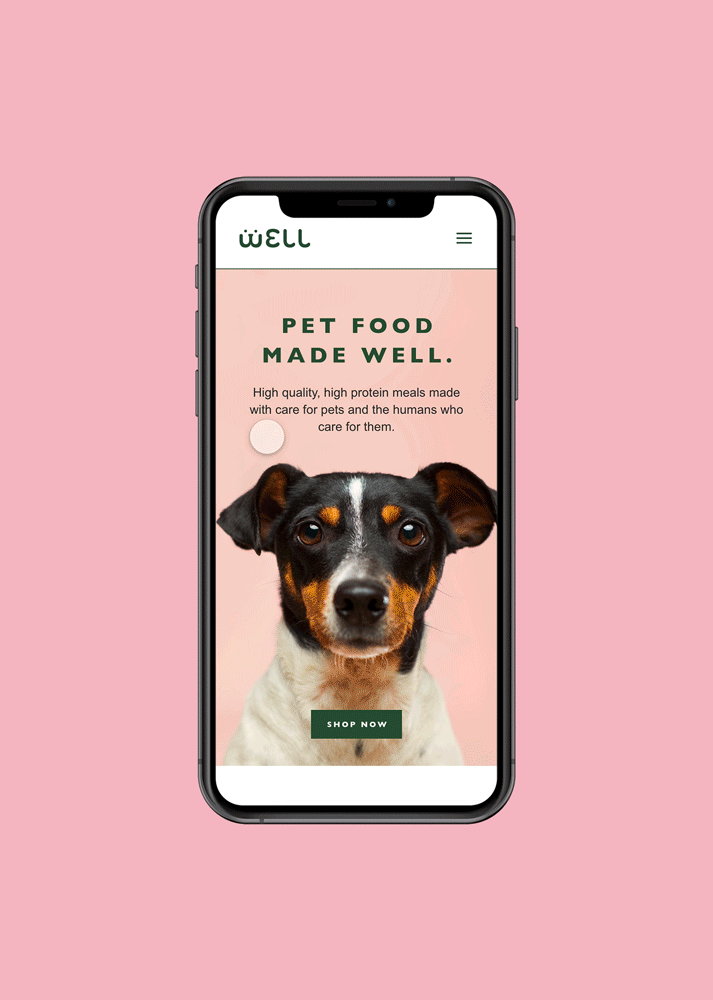
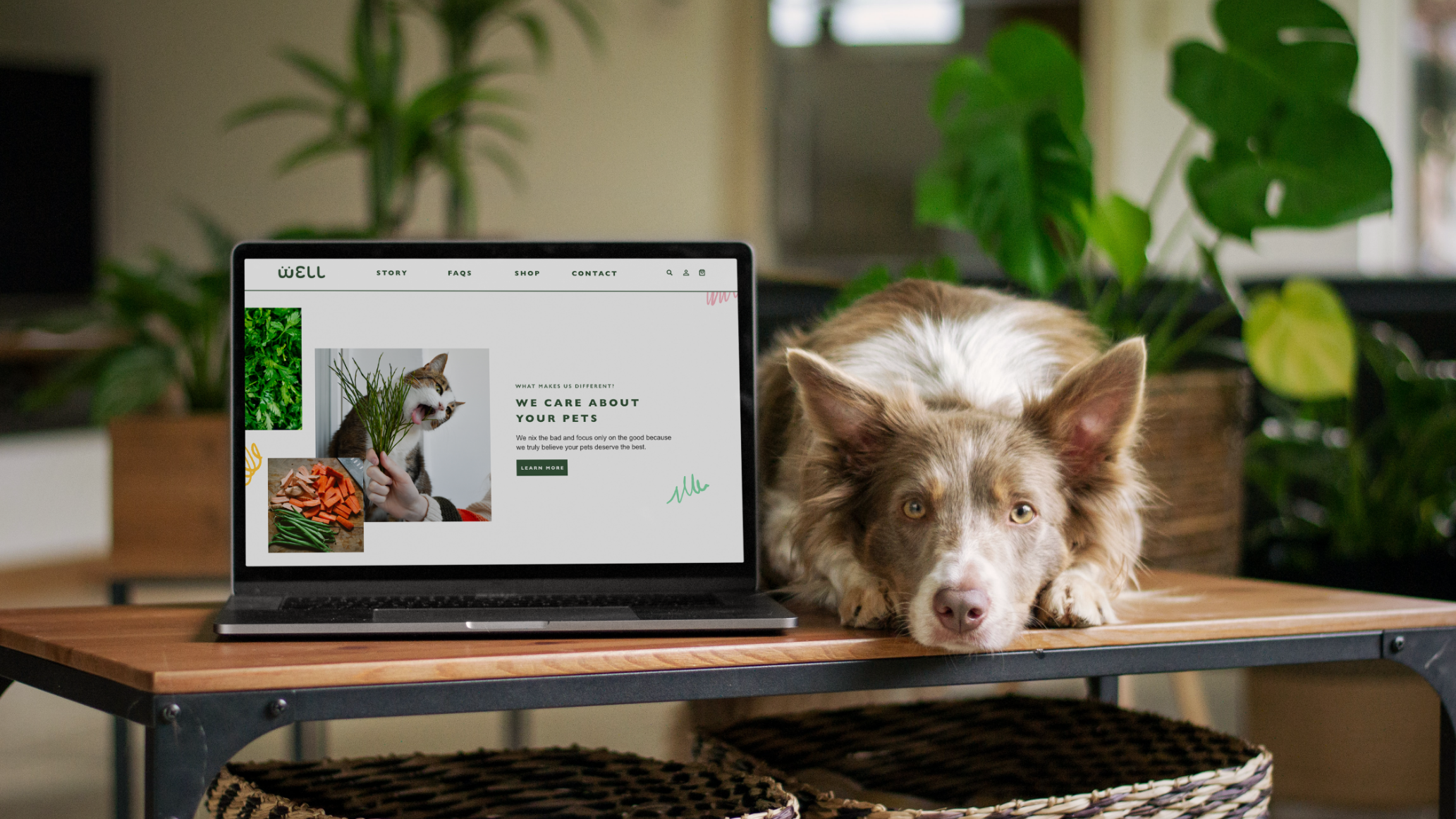
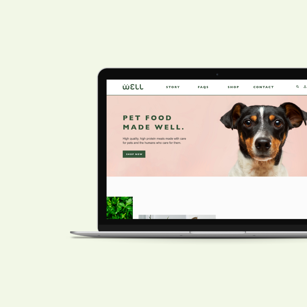
Final Prototype
My high-fidelity prototype followed the same user flow I had create for the low-fidelity prototype. I applied the design changes made after conducting the two usability studies to this prototype as well.
VIEW THE PROTOTYPE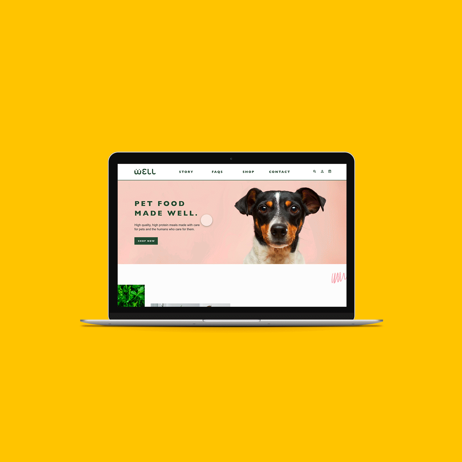
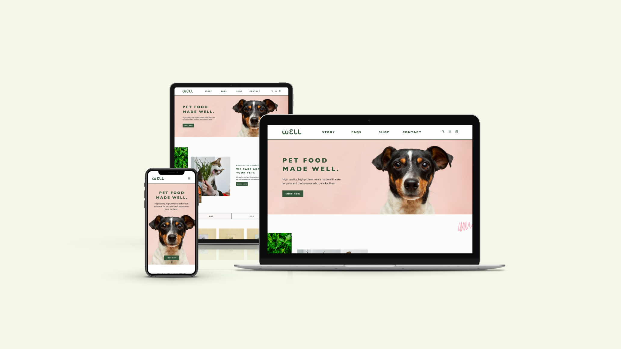
Responsive Design
I included designs for additional screen sizes since I wanted to ensure the site was responsive. Taking into consideration that many customers shop on different devices, I thought it was a crucial component of the project to ensure their experience across devices remained consistent.
Conclusion
Impact
Well target users shared that the design was intuitive and easy to navigate, they thought the image selections were a great way to guide them throughout the website, and they enjoyed the playful imagery and accompanying copy. Another thing that was mentioned was that they valued the level of transparency thought the site with the clear FAQs always being accessible in the top navigation.
What I learned
Through this project, I learned that today’s users are looking for convince, if a website is difficult to navigate through the changes of them returning is quite slim.
Next Steps
If I were to continue to work on this project, I would take the steps below in order to do so.
Step 1
Conduct a follow-up usability testing for the current website, also allowing participants to test out the mobile and tablet version of the sites to try and catch any further pain points before finalizing.
Step 2
Try and identify any further areas that need to be address including additional custom copy and images needed.
Step 3
Perhaps explore creating some kind of test users could utilize on the site to find out what food would be best for their pet.